A strong visual identity can really make or break a brand. Good branding is essential to brands that want to stand out and grab the attention of their target audience. This is especially important when a brand is considering producing its own merchandise — these promotional products should emphasise the visual identity of the brand.
We’re going to look at 4 brands that have solid visual identities’ and are recognisable, both here in Australia and globally. At the end of this blog, you’ll notice there is 3 key similarities between all 4 of our examples, which make them such successful and recognisable brands that produce epic merchandise.
So, let’s begin.
1. Vegemite
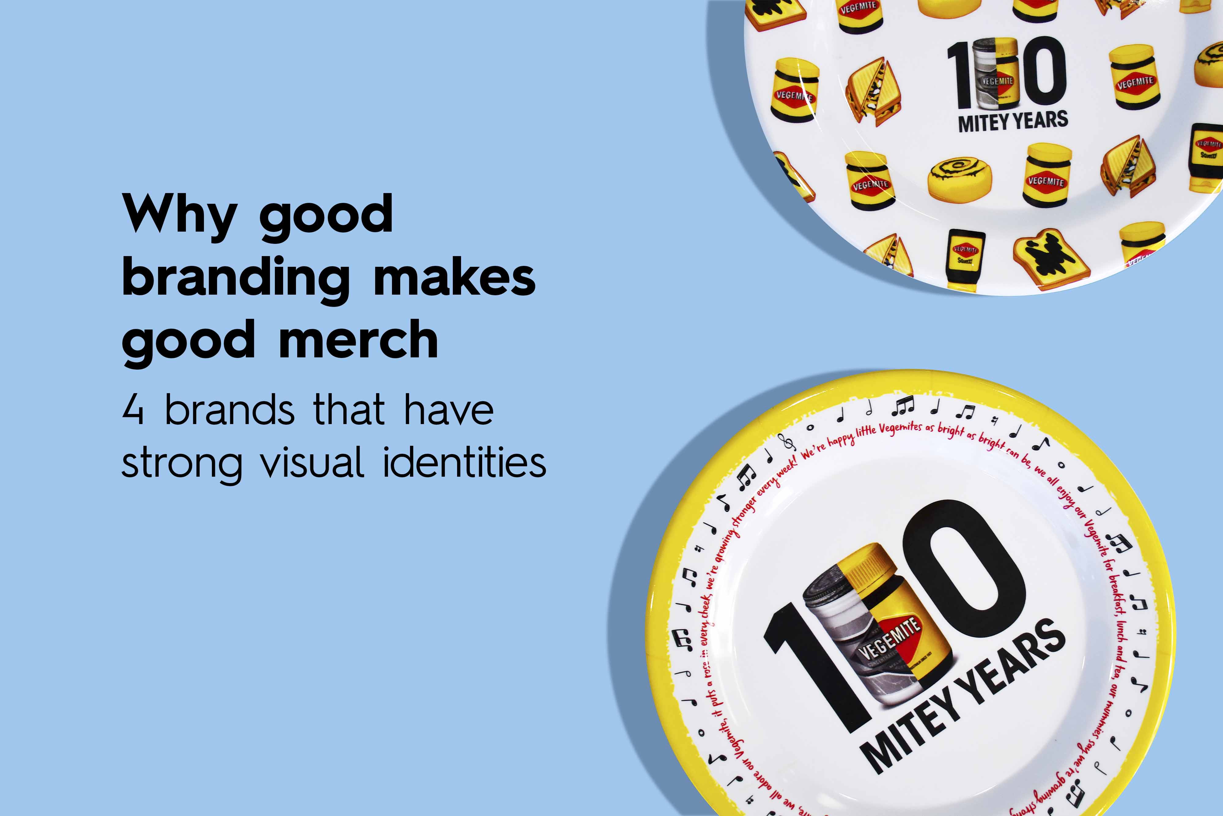
Mitey merch requires mitey branding, and Vegemite does just that.
Vegemite is a popular Australian spread. It’s distinctive and savory taste has become a beloved snack by many Australians. The spread has been around since 1923 and has become a staple in many Australian households. Vegemite is so beloved in Australia that it has been referenced in movies, TV shows, and even has a song dedicated to it. Since it’s creation, Vegemite has become more than just a spread, it has become a cultural icon in Australia.
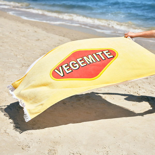
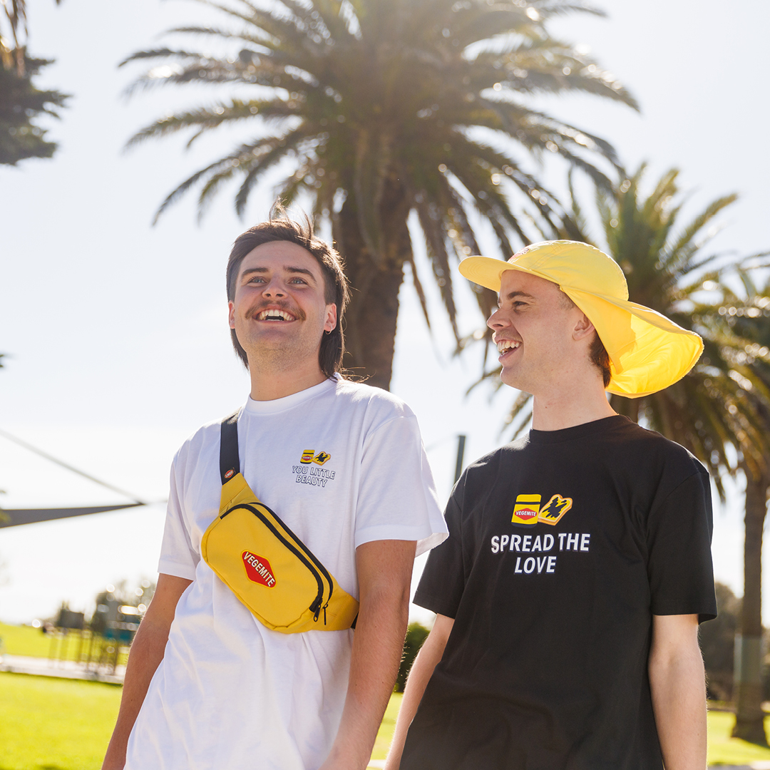
Vegemite ‘Mitey Merch’ has been blessing us since the late 1900s. From food tins and contains, to beach towels and sunhats. We’ve even mentioned before, that Vegemite creates merch that lasts a lifetime. Some Aussie households might even Vegemite merchandise from the late 90s and 2000s still in their pantry cupboard.
What is Vegemite’s brand identity?
Vegemite has a distinct visual identity that hasn’t changed very much in the almost 100 years it has been around. The colour palette of the Vegemite branding is centred around red, yellow, black and white. The use of red is particularly important, as it is used to draw attention to the logo and highlights the brand name. Plus, the Vegemite branding has a range of accompanying visual elements, such as Australian wildlife like koalas and kangaroos, as well as the iconic illustration of the Vegemite jar itself.
One of the most popular items in the Vegemite merchandise products is the customisable Vegemite jar, where you can print your name on the jar! The second most popular mitey merch item would be the beach towel. This has been a staple classic for generations, with several new towel designs being released every couple of years.
Why do people love Vegemite’s ‘Mitey Merch’?
Because Vegemite is such an iconic brand!
Everyone recognises the Vegemite logo — even in the US and the UK, people across the world know of Vegemite. Being a well-established brand that is turning 100 years old this year, the brand has evolved, developed and made an impact on many people. For Aussies, you grow up eating Vegemite and love it on your morning toast. But as an adult, you go out to the rest of the world only to discover that most non-Australians don’t like Vegemite! The unique taste but bold visual identity of Vegemite means it has been in the news and media for generations as a topic of conversation.
This is why Vegemite is so popular. It is a fun, colourful, bold brand with a bold taste — Tastes Like Australia.
2. Bunnings Warehouse
Bunnings is Australia’s leading warehouse retailer that specializes in hardware, home improvement and outdoor living products. You can browse the isles of Bunnings for hours looking at power tools, building materials, gardening supplies, kitchen appliances, outdoor furniture, lighting fixtures — the list goes on! Pretty much anything you can think of in regards to revonating your home, Bunnings will have it. Bunnings has become another iconic Aussie brand, one that is more commonly known for it’s sausage sizzles, also known as the Bunnings Snag, and Bunnings branded umbrellas.
What is Bunning’s visual identity?
From exclusive brands to the iconic sausage sizzle, Bunnings is a brand that has become synonymous with quality, reliability, and community spirit. But it is best visually known for it’s green sheds and big red hammer.
The Bunning’s logo is designed to be simple, bold, and instantly recognizable, making it easy to identify and remember. The color palette of the Bunnings branding is centered around green and white. The use of green is particularly important, as it is used to draw attention to the logo and highlight the brand name. White is used as an accent color, and is often used in combination with the green to create a fresh and vibrant visual effect.The iconic Bunnings logo creates a distinctive and powerful brand identity, to the extent where a Fillipino hardware store opened and looked almost identical to Bunnings. It took the internet by storm — people were furious that this company had copied the Aussie hardware giant, Bunnings, visual identity. Surprisingly though, Bunnings’ officials did not comment on the store and no legal action was taken. However, only a couple of months late the Filipino store re-branded and removed the shared similarities to the Bunnings green and red.
View this post on Instagram
Why are people obsessed with the Bunnings umbrella and straw hat?
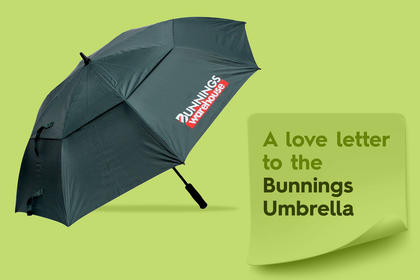
The answer lies within the question — because Australia constantly switches between rain and shine. Straw hats are an Aussie staple when it comes to ‘outback fashion’. We’ve seen a number of celebrities use the Bunnings umbrellas and even just this weekend, Harry Styles rocked the Bunnings Straw Hat at his Melbourne concert.
Although the Bunnings umbrella is incredibly popular, as well as the straw hat, that’s not all that Bunning’s merch consists of. The Bunnings merchandise includes branded items like paint buckets, toy trucks, dad caps, sport balls, car sun visors and ponchos too!
Overall, the Bunnings visual identity is designed to be simple, bold, and instantly recognizable. This recognition has become an Australian sight-seeing store. The brand’s simple but bold visual identity is what makes the branded merchandise desirable too.
To the legend who brought a @Bunnings hat to see Harry Styles, Australia salutes you. pic.twitter.com/NoVGchzFtA
— Jen Dudley-Nicholson (@jendudley) February 25, 2023
3. Petbarn
Petbarn is a popular destination for pet lovers across Australia. They offer a vast range products including food, toys, bedding, grooming products, and accessories for cats, dogs, birds, reptiles, fish, and small animals. They’ve taken all of these animals into consideration when creating their visual identity — giving life to animal character silhouettes.
What is Petbarn’s visual identity?
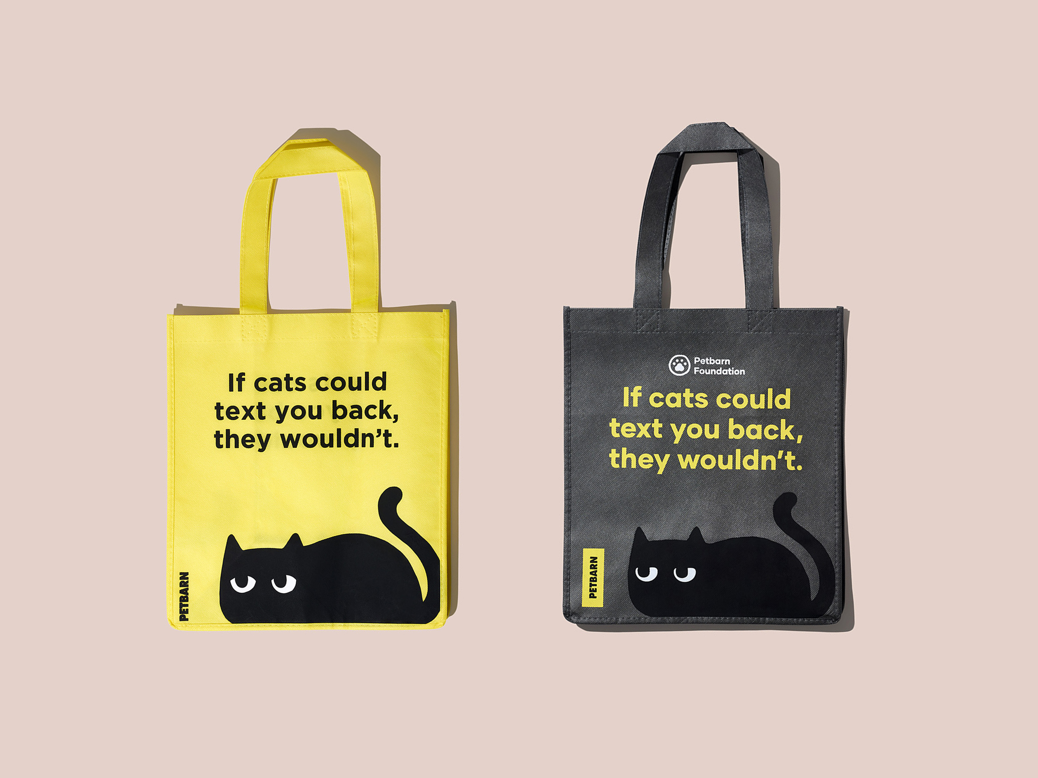
Petbarn’s key message is that they cater to all types of pets. To depict this message, they have create simplistic but fun little pet characters that accompany their brand logo and colours. The primary colour in Petbarn’s visual identity is yellow, followed by black which is what the little pet characters are, then lastly white is dispersed amougst the logo as well as the characters details.
Although not as famously known globally or even Australian-wide, Petbarn still has a strong presence within it’s pet retail industry because of how they have established their brand identity. With bold colours, a bold font and bold but fun characters.
What type of merchandise does Petbarn have?
As one of Petbarn’s merchandise distributor, we have a bit of inside knowledge of what type of branded merchandise they create. The best part of producing Petbarn promotional products, is the fun with have when creating the artwork mock-ups.
The Petbarn yellow and black characters and playing tone of voice make creating merchandise for the brand really enjoyable. Our whole team has commented on how great it has been creating the cat tote bags and dog tote bags. They’ve also got a great little tennis ball, or as they like to call it the fetch ball, in a variety of colours — yellow is their signature though.
Overall, Petbarn is a leading pet retailer in Australia, primarily because of how they have positioned their brand in the market. The brand’s commitment to high-quality products, competitive pricing, and excellent customer service has made it a popular destination for pet lovers. But it’s strong but fun and playful branding give the brand that extra element to customer satisfaction.
4. Ikea
Ikea is a Swedish multinational furniture retailer that is known for its affordable and stylish furniture and home accessories. A global brand with international stores, Ikea’s range includes everything from sofas, beds, dining tables, home décor items, kitchenware and storage solutions. Ikea caters to the needs of people of all ages and lifestyles, and the brand is committed to making quality furniture accessible to everyone.
In addition to furniture and home accessories, Ikea also offers a range of food items in its restaurants and Swedish Food Market. This too has added to the brand’s reputation. It common to hear about someone having the classic Swedish meatballs and lingonberry sauce when they last visited an Ikea store.
Ikea has become a go-to destination for people looking to furnish their homes with style and affordability globally.
What is Ikea’s visual identity
The Ikea visual identity is a distinctive and recognizable brand that is known for its clean, modern design and bold use of color. The primary element of the branding is the Ikea logo, which features the brand name in bold, uppercase letters with a distinctive blue and yellow color scheme.
The use of these two colors is particularly important, as they reflect the brand’s Swedish heritage and commitment to simplicity and functionality in design. Sweden is well-known for it’s astehtically pleasing and simple taste in design, so this compliments the brand’s origins. The blue is often used to represent trust and stability, while the yellow is associated with happiness, optimism, and energy.
In addition to the logo and color palette, the Ikea branding also includes a range of other visual elements, such as the use of clean lines and geometric shapes in product design and advertising campaigns. The brand is also known for its use of playful, innovative advertising campaigns that often incorporate humor and cultural references to engage customers.
What type of merchandise does Ikea have?
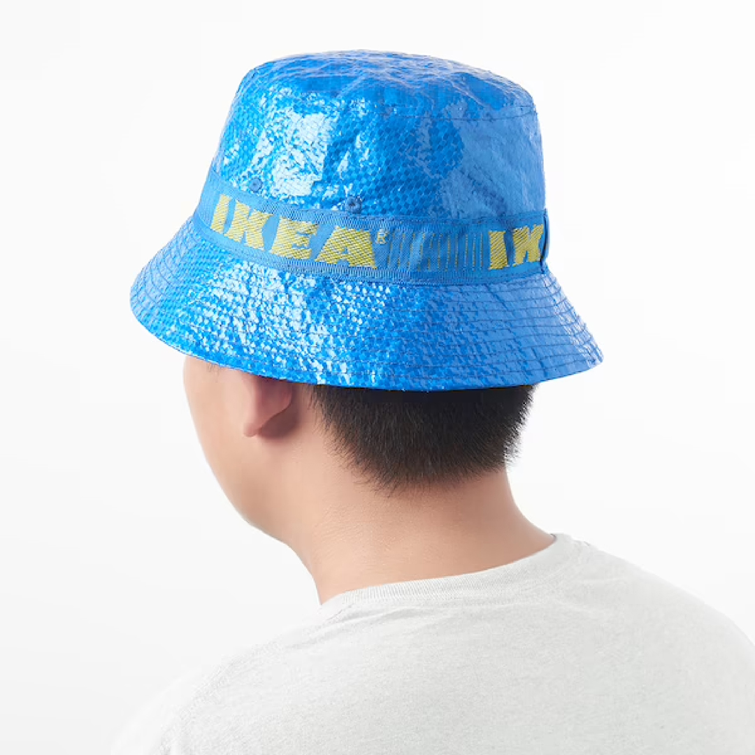
It’s safe to say that almost everyone is familiar with the Ikea large carrier bags called FRAKTA. These often become people’s laundry bags or come in very useful when moving houses or donating clothes. They are so popular in fact that Ikea created a smaller version, a tote bag that can be used at the supermarket. The bags have gained so much street attention and popularity that Ikea has even created a matching bucket hat, called KNORVA.
Although Knorva isn’t currently available in Australia, it is stocked in Ikea store occasionally here. The bucket hat is widely available in Europe and the US. So if you’re desperate for a matching Ikea hat, you know where to go (or you can just order one online I suppose).
The 3 things we learned from these 4 examples
- Simplicity is key.
In order to have a strong visual identity you need to be simple and consistent. All 4 of these brands use a maximum of 4 colours throughout their branding. The fonts used are also bold and legible. If they do have any accompany visual elements, they are again simple and tend to use one colour (like the red hammer from Bunnings or the black animals in Petbarn).
- Use your primary brand colour
This one is pretty self explanatory. Stick to the primary colour of your brand (yellow for Vegemite, green for Bunnings, yellow for Petbarn and blue for Ikea).
- Give your audience a reason to want your merch
With all our of these examples, the brands are well-known either within Australia or globally. They have built up their brand’s reputation over years with strong and consistent branding, making their brand admirable in the eyes of their customers. Producing clever branded merchandise should become an additional touch-point for your brand.
So if you’re looking to achieve that next step in establishing your brand reputation and emphasising your brand visual identity, get in touch and we can help create some fun and lovable merch.

